LinkedTour
A programme that places people into paid hotel traineeships in China, running since 2008. The old website held every fact and none of the confidence. The brief was to lose nothing and change everything about how it feels.
Scroll the design.
The notes follow you down the page. Each one explains why that part of the screen is built the way it is, and what it is doing to the person looking at it.
The numbers on the first screen
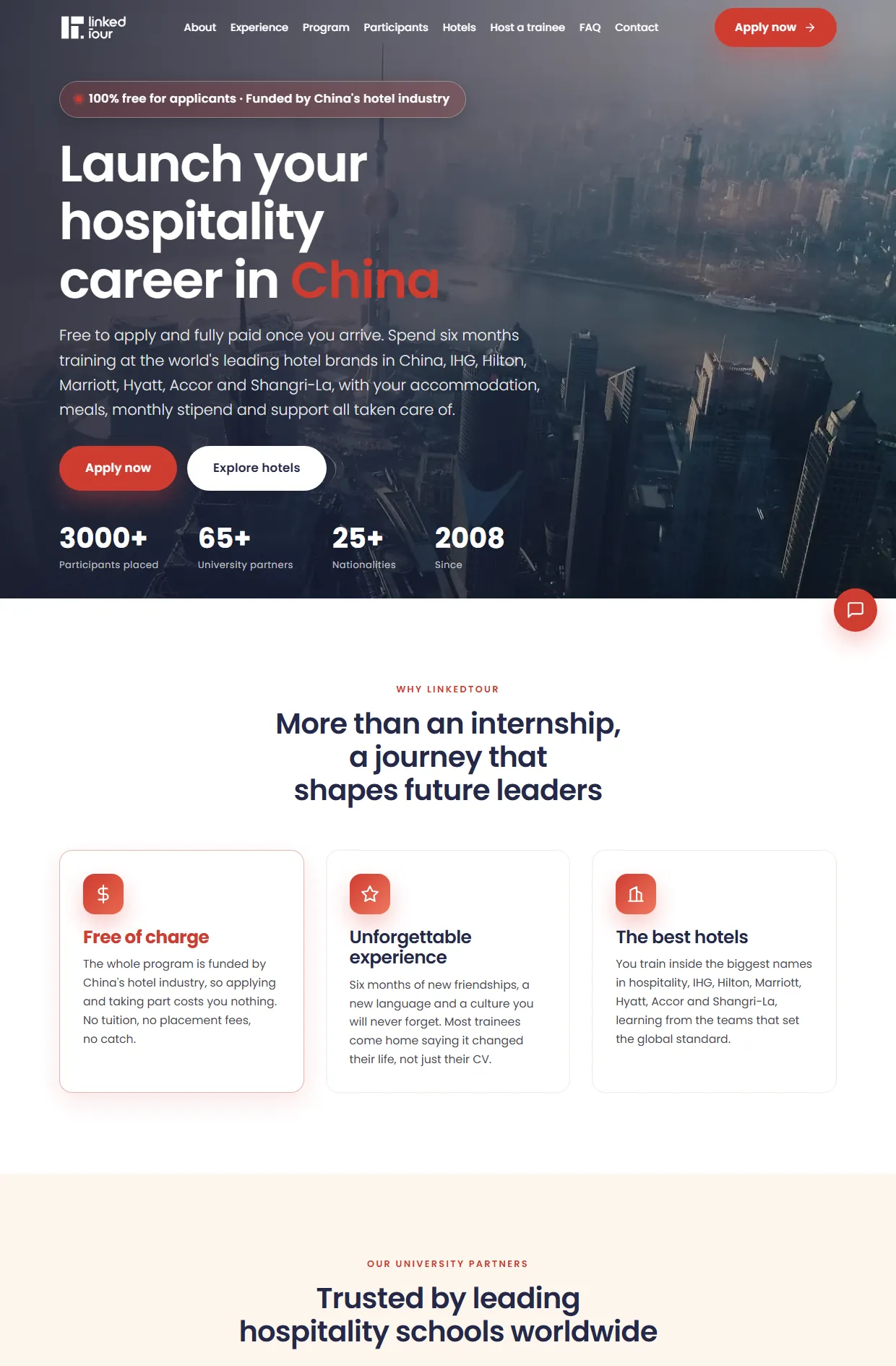
The first screen says the programme is free for applicants and funded by the hotel industry. The numbers sit right under it: 3000 people, 65 universities, 25 nationalities, since 2008. The old site had those numbers too, buried in paragraphs.
Real positions, not promises
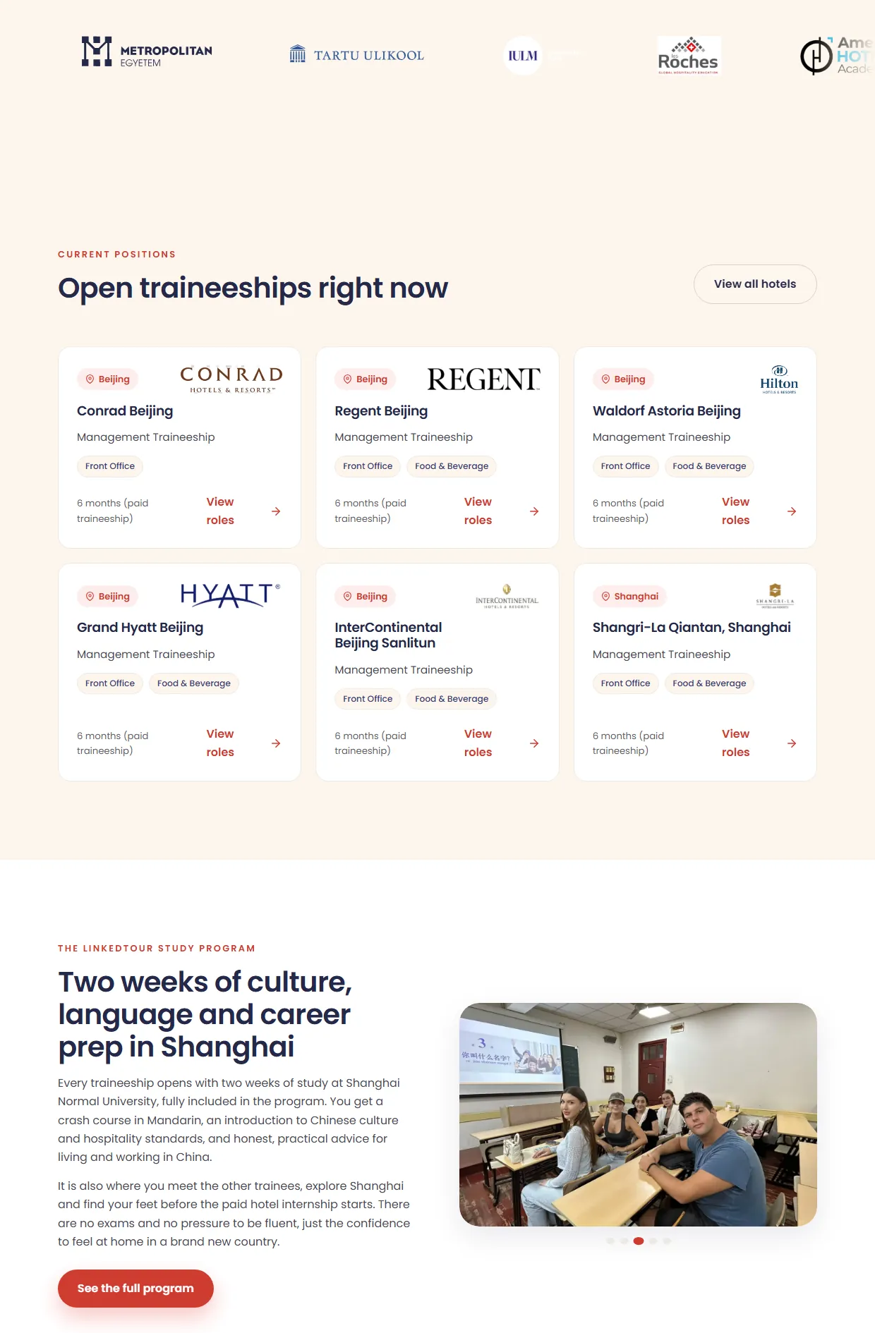
After the university logos come the open positions, with the hotel, the city, the department and the length of the traineeship. Below them are the two weeks of preparation in Shanghai. Seeing an actual hotel and city makes the programme stop being abstract.
When it starts and what is covered
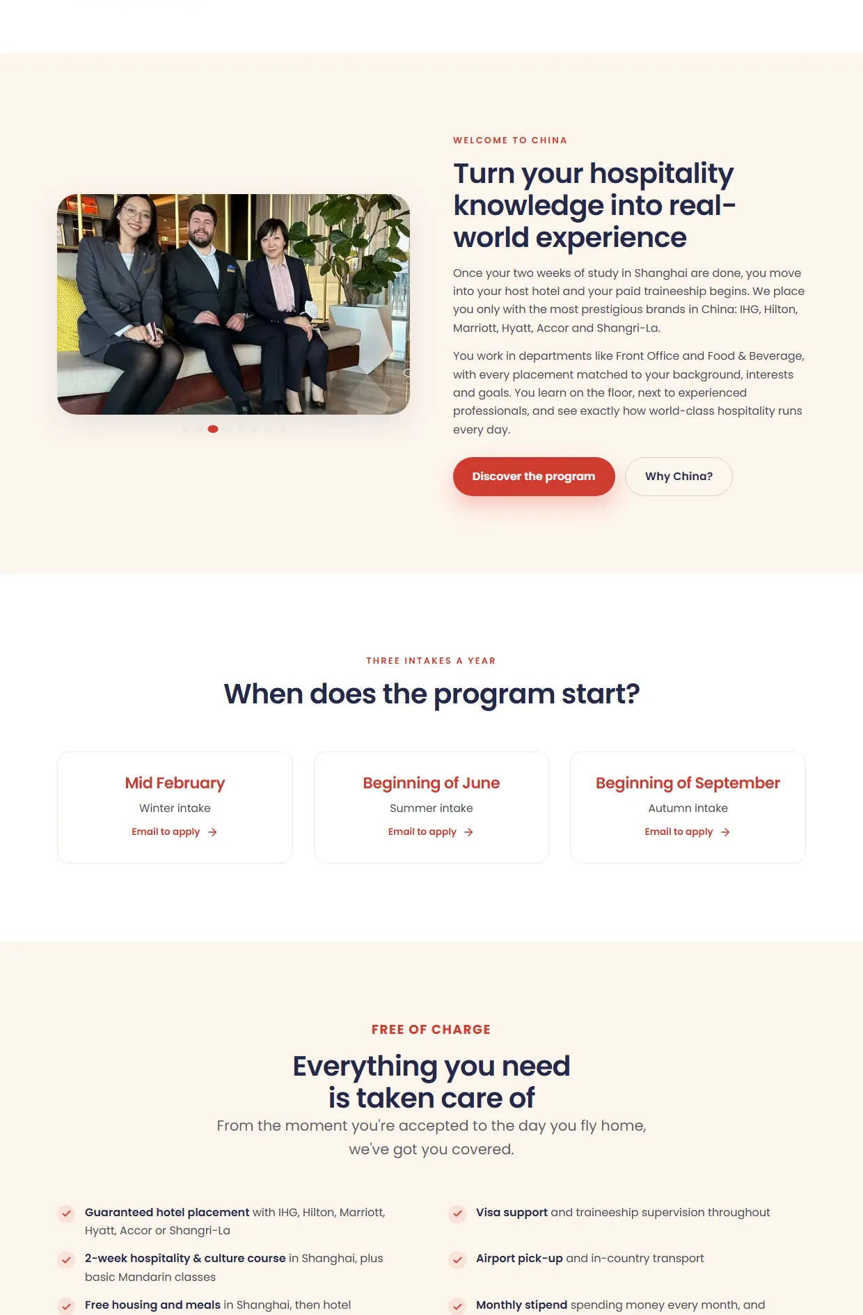
Here you see what the traineeship looks like after the course, and which hotel brands take part. Right below are the three intakes a year. Then the list of what is covered: housing, meals, visa, insurance and a monthly stipend.
People who have already gone
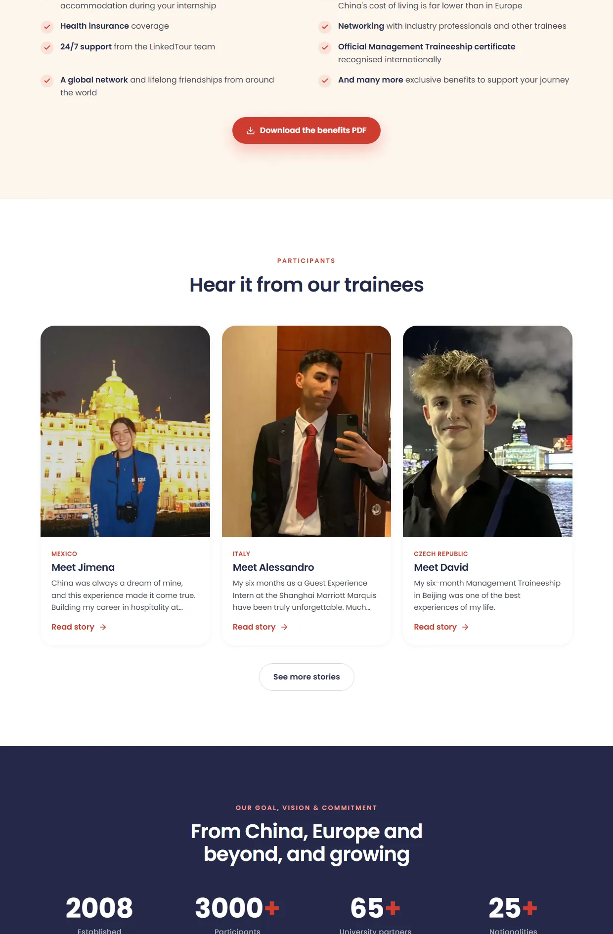
After the list there is a button for the benefits PDF, for anyone who wants to read it in peace. Then come the trainees, with a photo, a country and a short story. A student trusts someone who was in their place six months ago.
Known names, then the ask
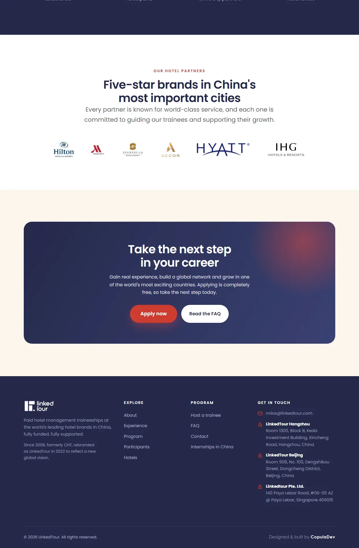
At the end come the hotel logos: Hilton, Marriott, Hyatt, Accor, IHG, Shangri-La. Only after them does the final call to apply appear. The famous names are kept for the moment somebody is already thinking about it.
The proof existed, it just was not on the first screen.
The old website held every number, buried in paragraphs. The redesign did not add a single new fact. It put the existing ones where somebody sees them before deciding whether to keep scrolling.
When a programme has run since 2008 and placed three thousand people, that is the strongest argument available. Everything else on the page is arranged to lead towards those figures rather than compete with them.
Do you like this concept?
Want this kind of thinking on your website?
Two sentences are enough to start. What you sell, and who you sell it to.
You get an honest answer on whether a website solves your problem at all, what it would cost, and how long it would take. No pitch deck, no discovery call that turns into a sales call.