Slatka Obmana
A studio that makes cakes look like anything except cake. The website had one job: make a visitor doubt their own eyes, then hand them a way to order.
Scroll the design.
The notes follow you down the page. Each one explains why that part of the screen is built the way it is, and what it is doing to the person looking at it.
The slider on the first screen
The first screen has a before and after slider. You drag it and see that the burger is actually a cake. Instead of reading that they are good, you check it yourself in two seconds.
One cake first, then the shelf
Right below it, a single cake is told in full, with the occasion and the hours of work behind it. Only after that comes the shelf with eight more. You see what one job looks like before you see how many there are.
A gallery that needs no text
Deeper in the gallery there are no long descriptions, only the picture and the name. A Chanel bottle, SpongeBob, a Minecraft block, all of it is cake. Nothing needs explaining here, the photo does the work.
How the job runs, and the numbers
Here the job is laid out in five steps, from the first conversation to the handover. Under it are the numbers: 847 cakes, 312 celebrations, 27 cities. When you know what to expect and how much they have done, ordering is easier.
Two ways to get in touch
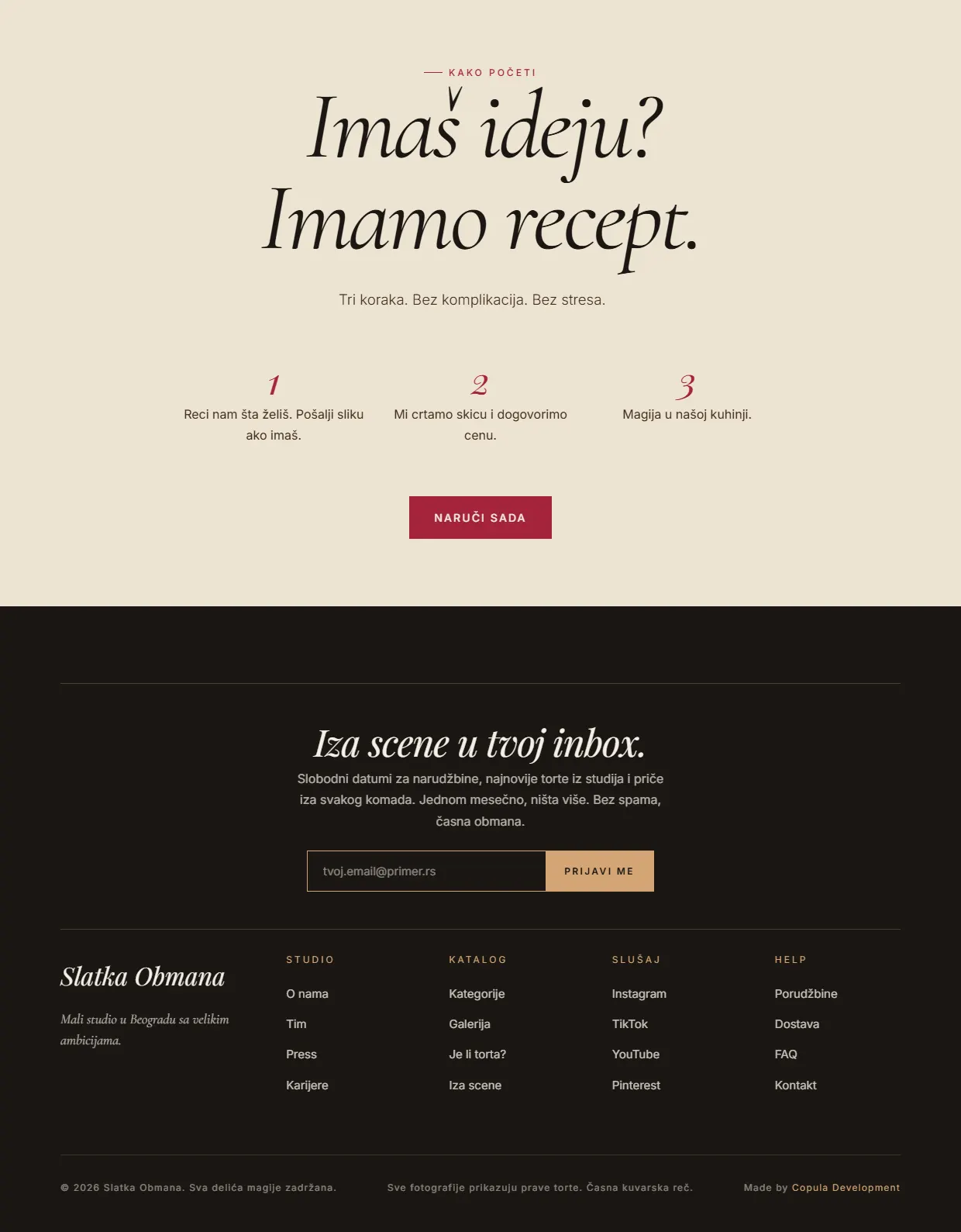
The end has three steps and an order button. Anyone who is not ready to order can just leave an email instead. Nobody has to leave the page with nothing.
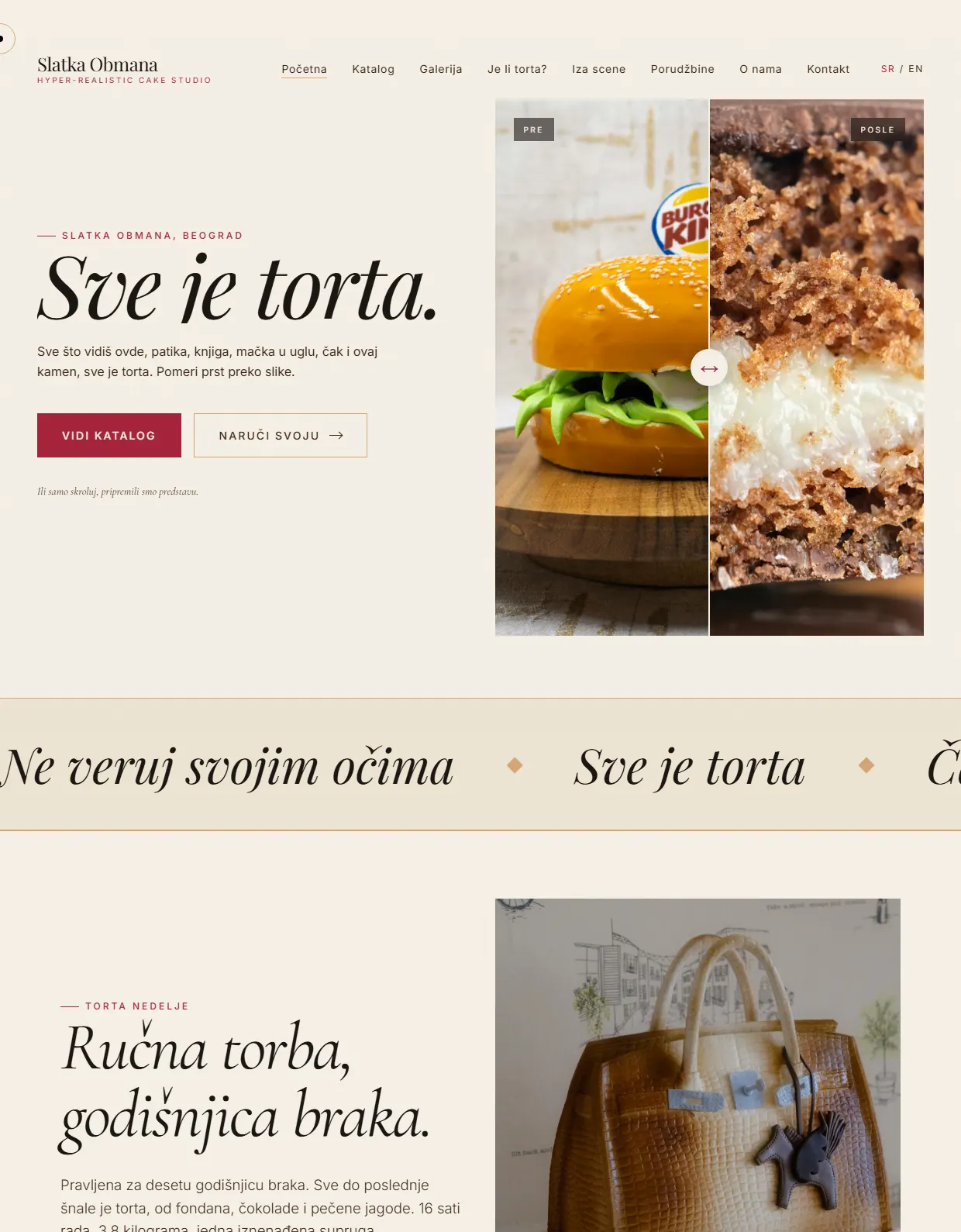
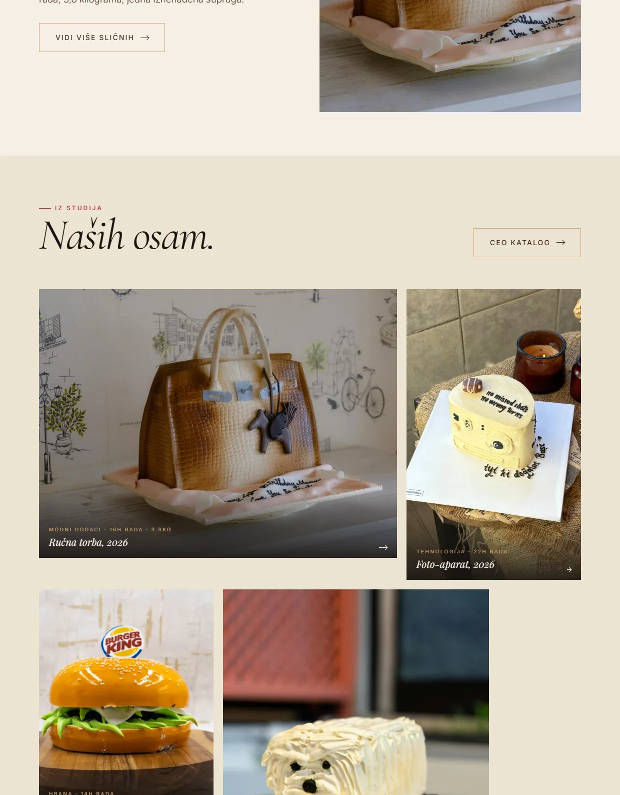
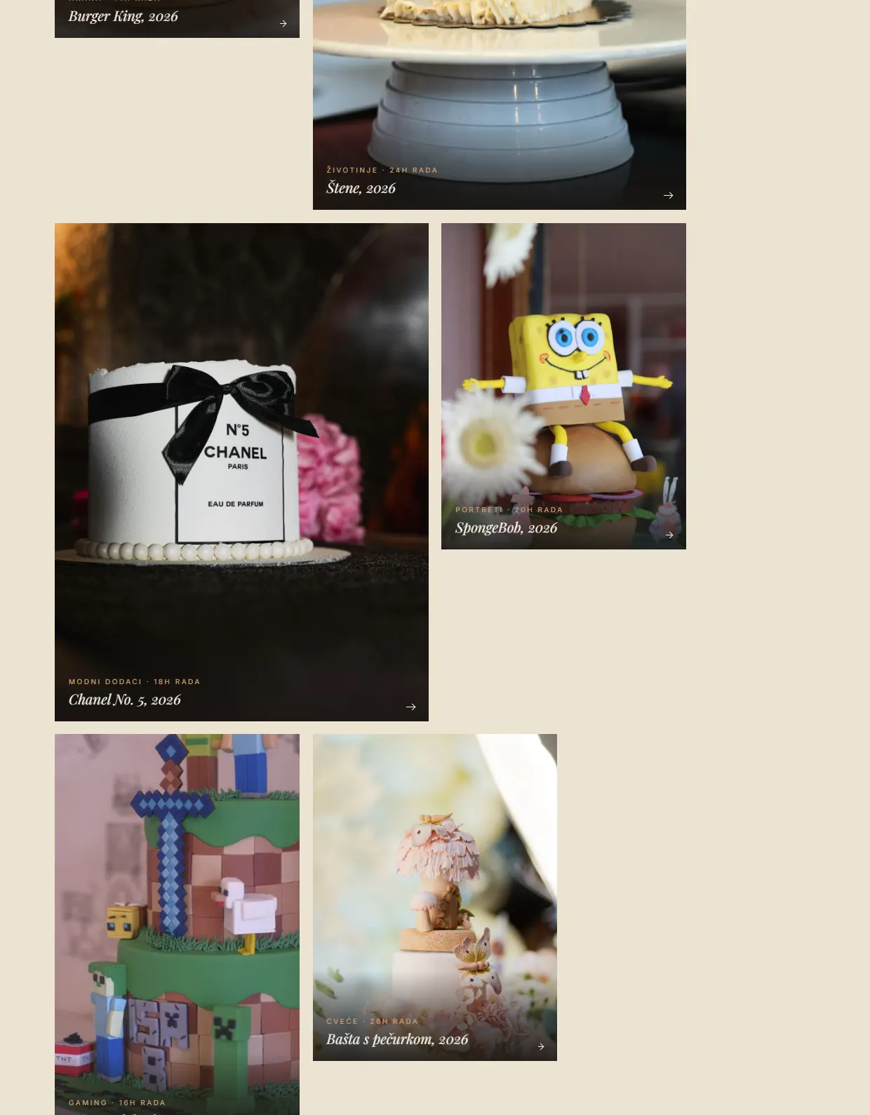
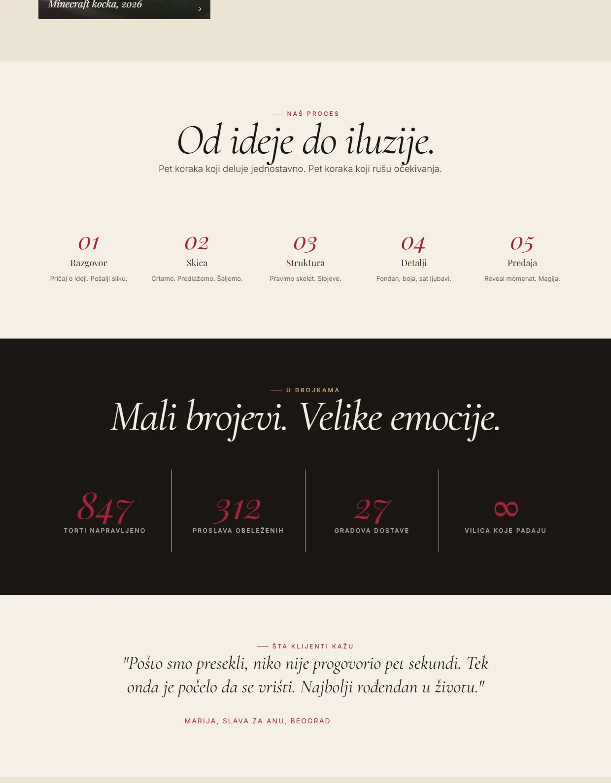
The illusion has to survive a closer look.
This studio makes cakes that look like anything except cake, so the whole business rests on one moment: when you realise what you are looking at. A small or soft photograph never delivers that moment. The pictures are the largest element on every screen, and everything else steps back so it does not get in their way.
The writing is deliberately short. When an image is doing this much work, a sentence describing it only takes something away. What stays is what a photograph cannot say: the occasion, the hours behind it, and how to order one.
Do you like this concept?
Want this kind of thinking on your website?
Two sentences are enough to start. What you sell, and who you sell it to.
You get an honest answer on whether a website solves your problem at all, what it would cost, and how long it would take. No pitch deck, no discovery call that turns into a sales call.