BUM! Studio
A comic publisher that sells its own titles. The design had to sound like a comic before a single word gets read, and then get out of the way of the checkout.
Scroll the design.
The notes follow you down the page. Each one explains why that part of the screen is built the way it is, and what it is doing to the person looking at it.
You can see it is a comic
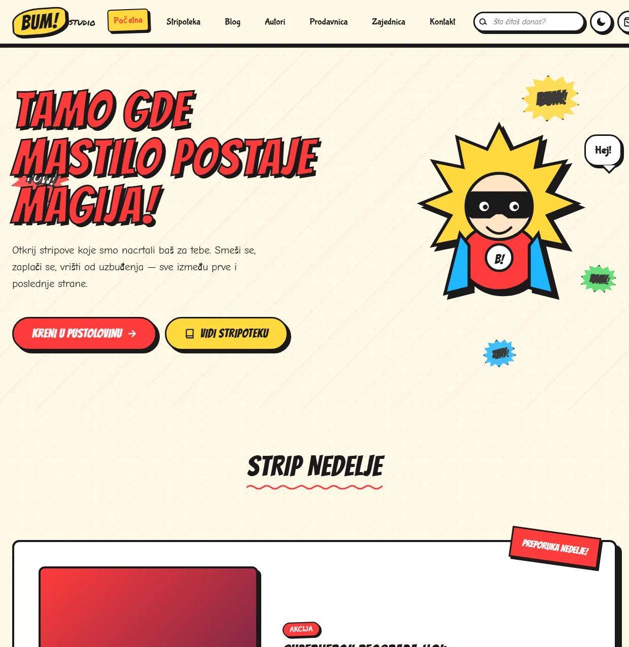
The first screen looks like a comic cover: thick outlines, yellow and red, speech bubbles. Before you read a single word, you know what kind of place this is. The comic of the week sits right below, so you do not have to choose.
One pick, then six more
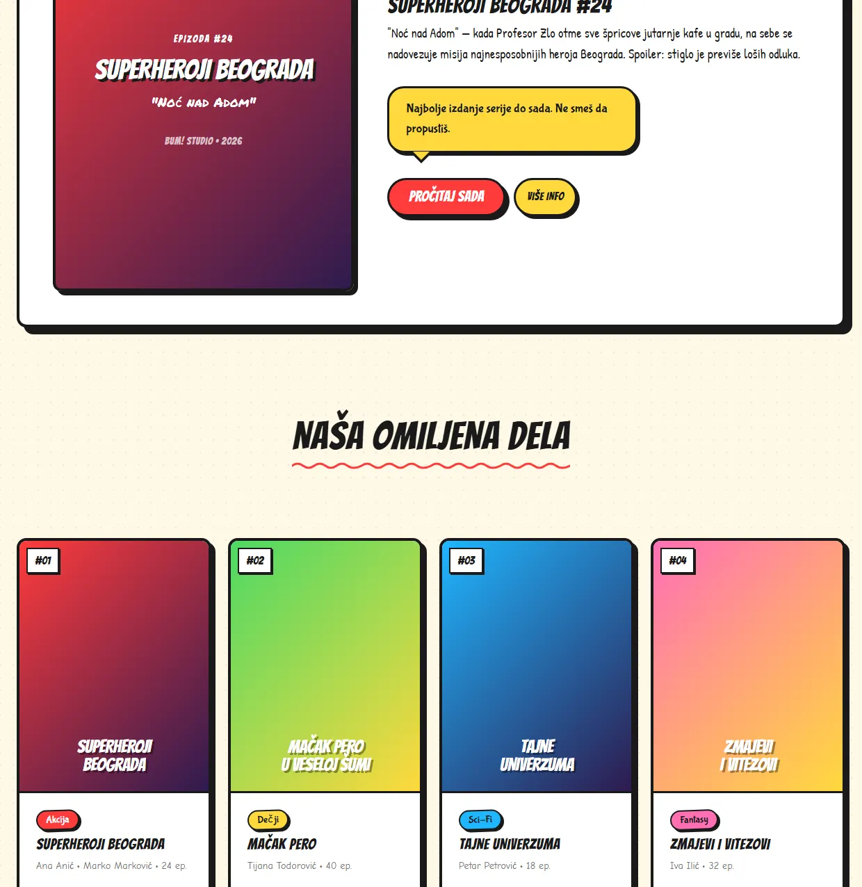
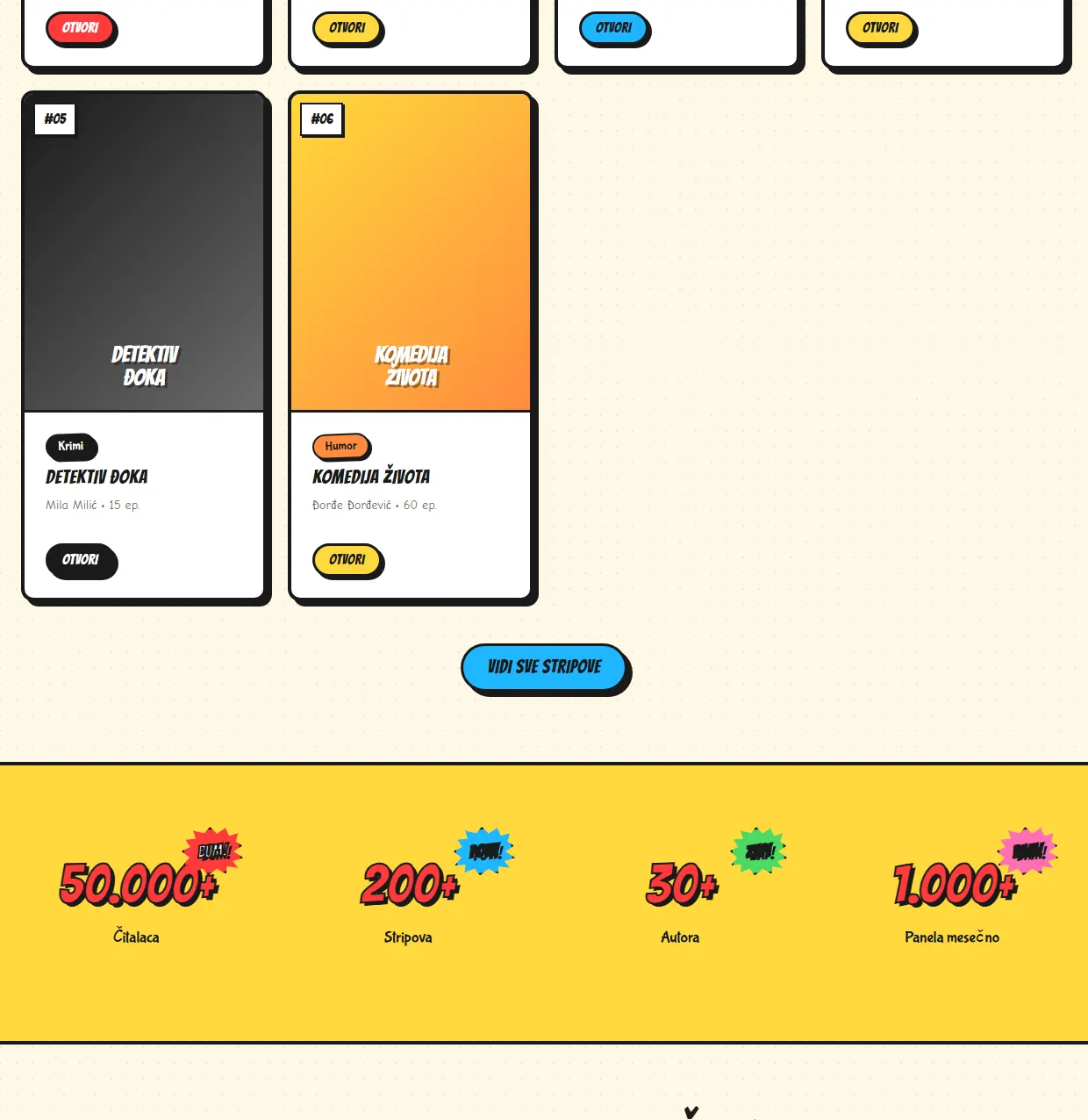
The comic of the week gets a card of its own: cover, short description and two buttons, read now or find out more. Six titles follow, each with the genre, the author and the number of episodes. The same two buttons repeat, so nobody has to learn a new layout.
Numbers at the end of the shelf
After the last two titles there is a button to the whole library. Below it a yellow band carries the numbers: 50,000 readers, 200 comics, 30 authors. Numbers like that make a small publisher look like a place worth coming back to.
Pick by mood, not by genre
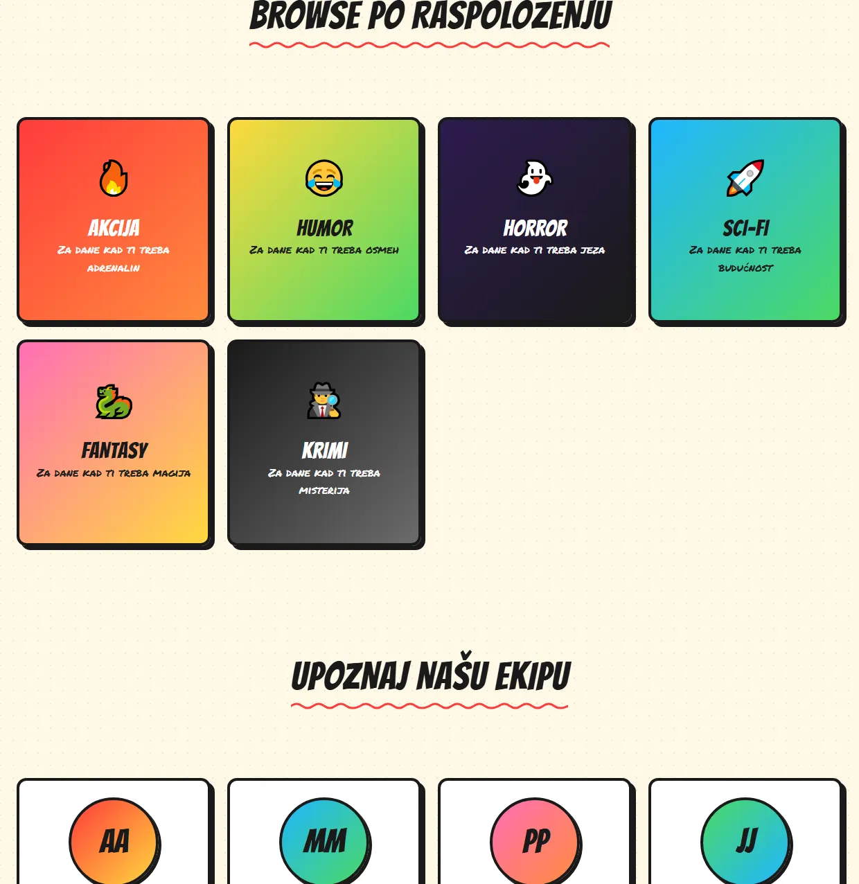
The genres are written as moods: action when you need adrenaline, humour when you need a laugh. People rarely look for a genre, they usually know how they feel. Below them the team that draws the comics begins.
The people behind the comics
Every member of the team gets a photo, a role and one sentence in their own words. After them comes the red band for the newsletter. It is easier to leave your email with people you have just met.
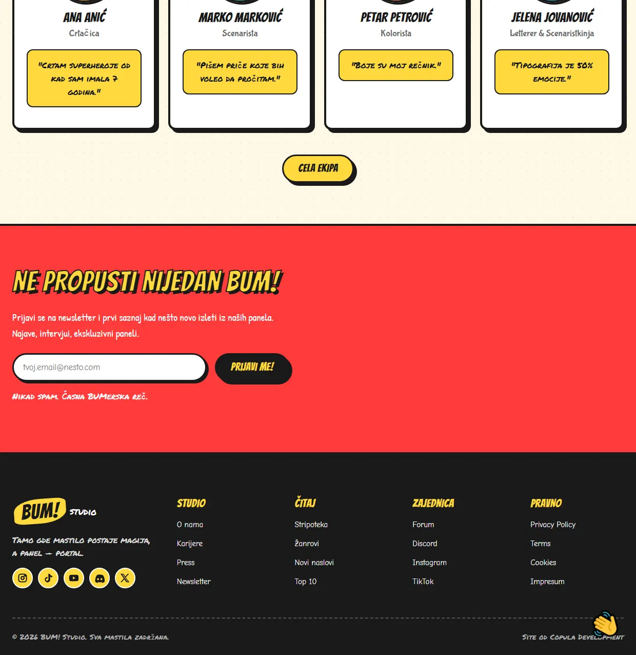
A shop that does not look like a shop.
Comics are bought on mood rather than need, so everything that builds mood comes first: ink outlines, paper grain, speech bubbles, colour. Prices and buttons only appear once the reader is already inside the world.
The path to checkout is the shortest part of the page, on purpose. Every step between wanting something and paying for it is a place where somebody changes their mind, so that path was designed first and decorated last.
Do you like this concept?
Want this kind of thinking on your website?
Two sentences are enough to start. What you sell, and who you sell it to.
You get an honest answer on whether a website solves your problem at all, what it would cost, and how long it would take. No pitch deck, no discovery call that turns into a sales call.