LoveTypes
The personal page of Dr Alex Avila and his bestseller Love Types, in English and Spanish. A free quiz leads to the book, and the page had to carry both without choosing one.
Scroll the design.
The notes follow you down the page. Each one explains why that part of the screen is built the way it is, and what it is doing to the person looking at it.
The book is the first thing you see
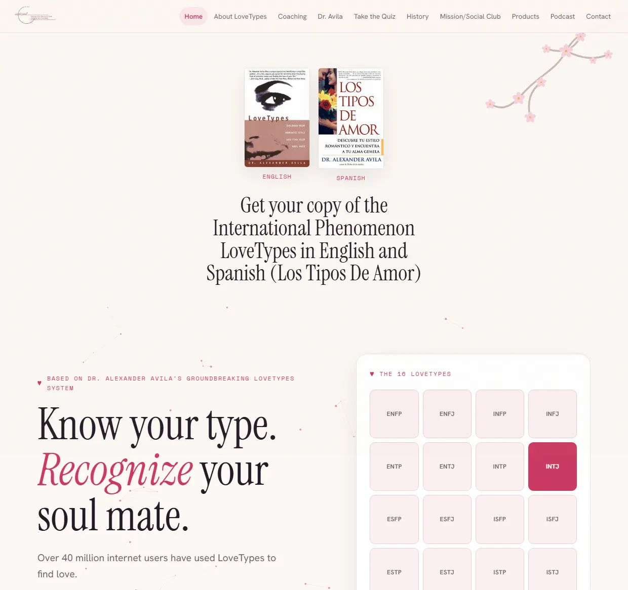
Both covers sit at the top, the English one and the Spanish one, so you know what this is. Below them is a headline that explains the system in one sentence and a board of the 16 types. Anyone who has heard of the book recognises it at once.
The quiz, then the app
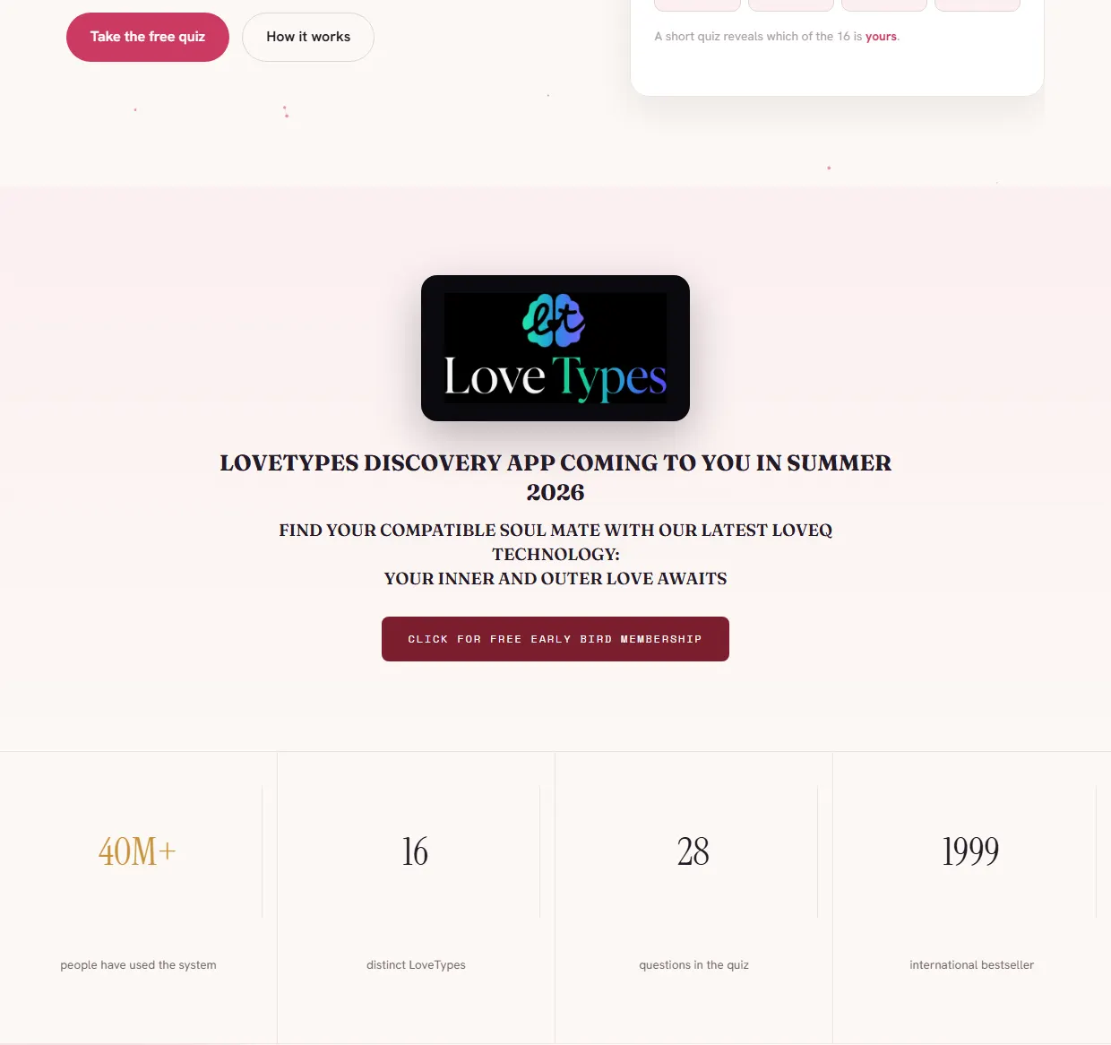
The free quiz button sits right next to the board of types. Under it is the app announced for summer 2026, with early sign-up. The numbers close the section: 40 million people, 16 types, 28 questions, a bestseller from 1999.
Three steps, no promises
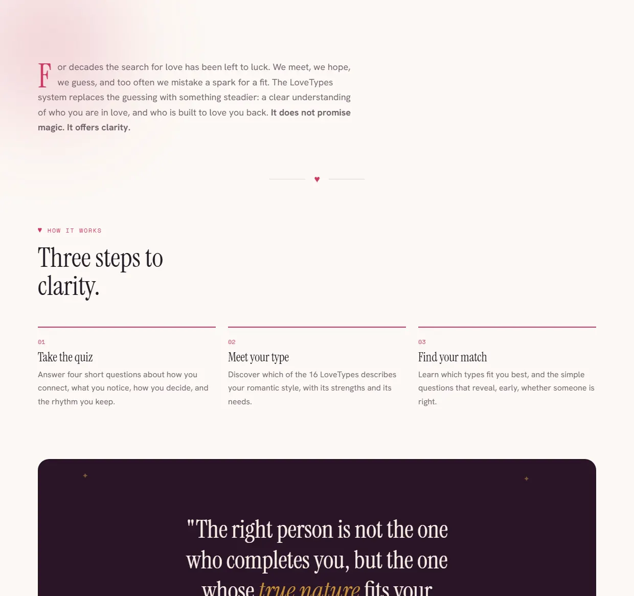
A short text says what the system does and what it does not promise. Below it are three steps: take the quiz, meet your type, find your match. Split into three steps, it looks easy enough to try.
What readers say
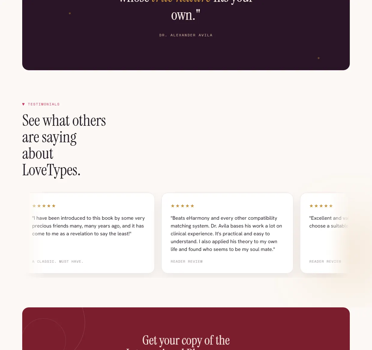
After one line from Dr Avila come the reader reviews, with ratings and full quotes. These are people who have read the book, not an advert. That is why they sit just before the invitation to buy it.
Two versions of the book
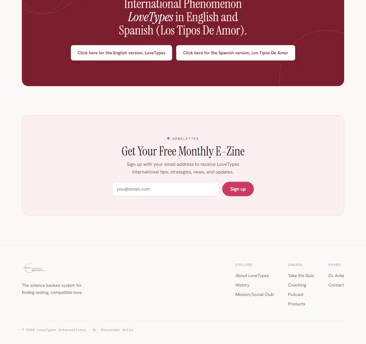
At the end there is a red block with two buttons, the English version and the Spanish one. Under it sits the sign-up for the monthly e-zine, for anyone who is not buying yet. One exit for now and one for later.
A page that talks about the reader, not about itself.
The product here is self knowledge, so every sentence has to be about the person reading it. The headline, the questions, the examples, all in the second person. The moment a page like this switches to what we do, attention leaves.
The quiz is free and stands in front of the book that costs money. Something that costs nothing goes first, because a person who has already spent ten minutes finds it much easier to spend money afterwards.
Do you like this concept?
Want this kind of thinking on your website?
Two sentences are enough to start. What you sell, and who you sell it to.
You get an honest answer on whether a website solves your problem at all, what it would cost, and how long it would take. No pitch deck, no discovery call that turns into a sales call.