Golden Cut
A barbershop that charges above the street average. The website has to justify the price before the price is read, and then make booking the easiest thing on the screen.
Scroll the design.
The notes follow you down the page. Each one explains why that part of the screen is built the way it is, and what it is doing to the person looking at it.
Price is read in the palette
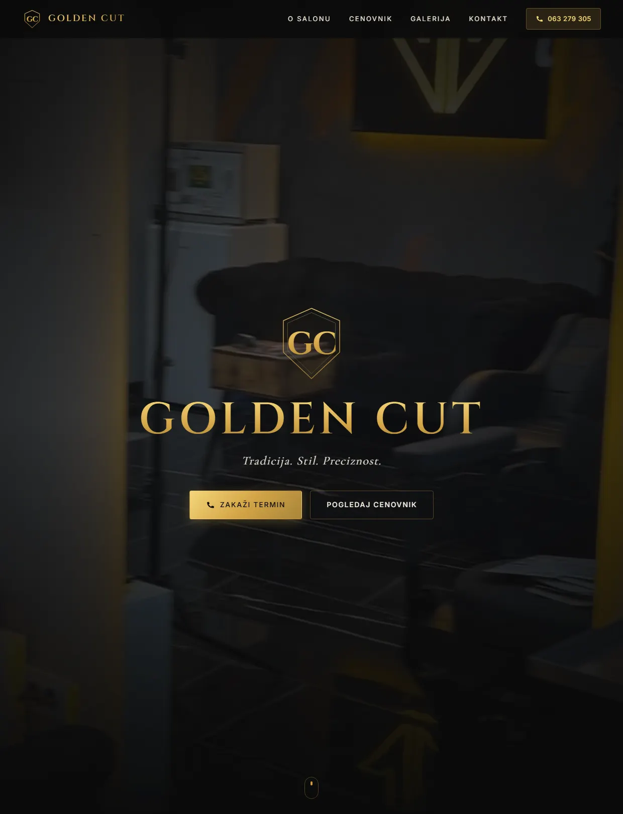
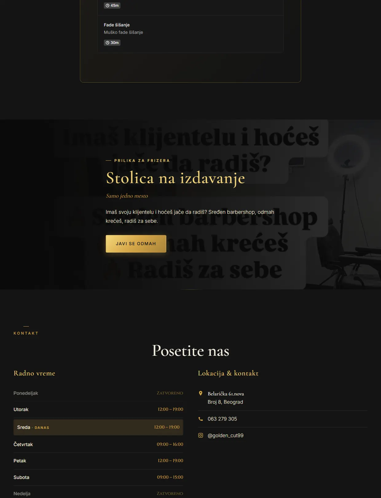
Deep background, restrained gold, a lot of empty space. Premium is signalled by what is left out, and a visitor prices a service from the design long before reaching the list. The phone number sits in the same screen because part of this audience will never fill in a form.
Context first, then the number
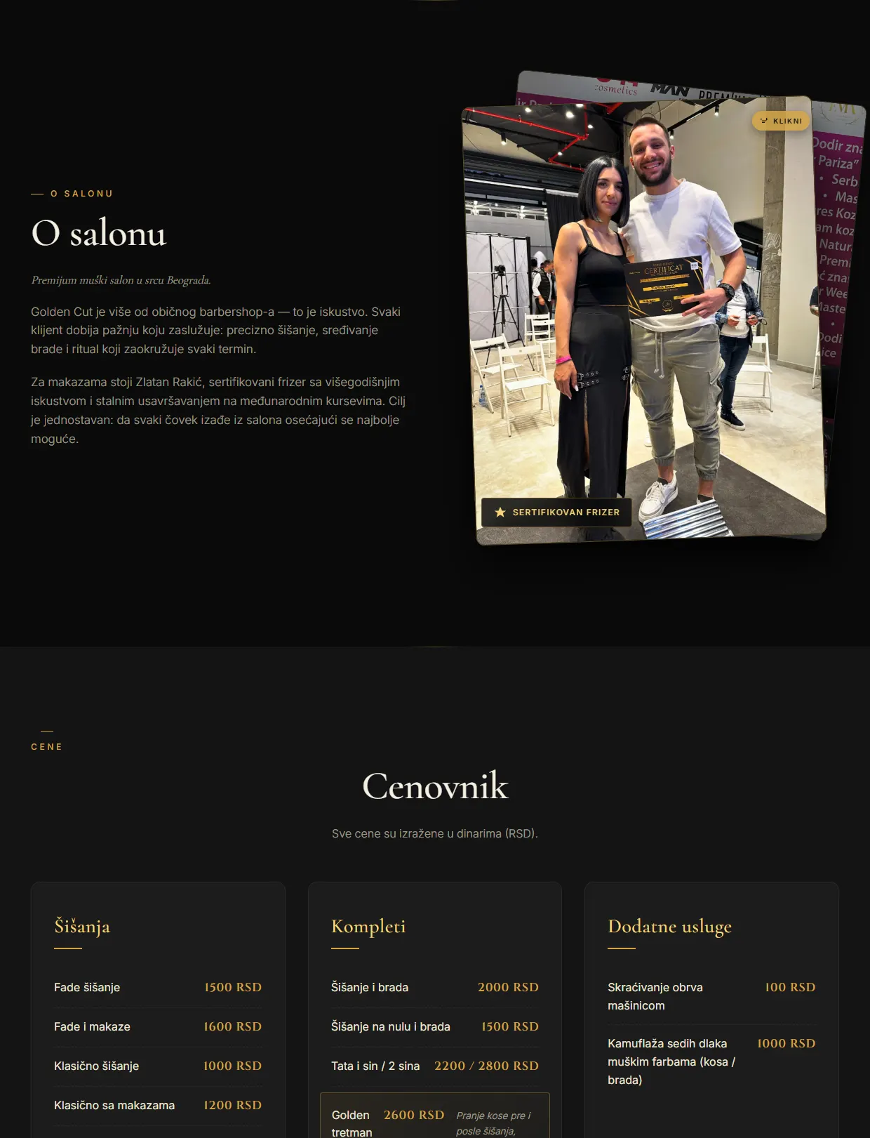
The salon introduces itself immediately above the price list, and the list is split into cuts, combinations and extras. Context turns a number into value instead of a bill, and once a full combination is on the table a single cut reads as the modest choice.
The result, not the room
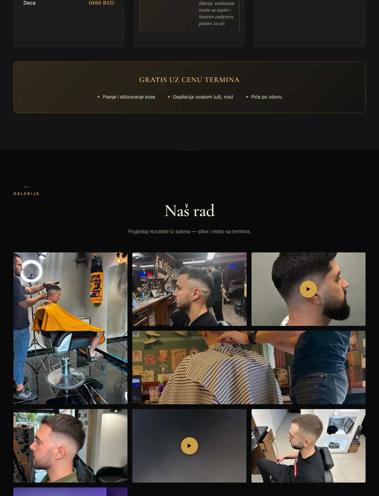
Eight photographs of finished cuts instead of interiors and equipment. A buyer pictures themselves in the outcome, and the outcome is what is actually being sold, so the gallery is faces and fades rather than furniture.
Booking without asking anyone
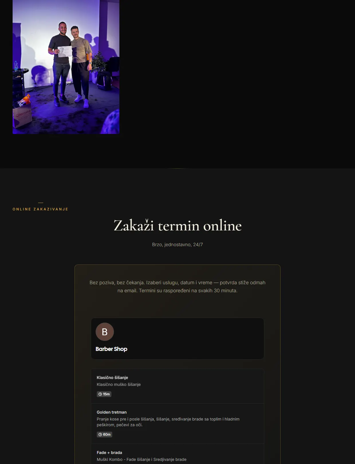
The calendar lives inside the page, with each service and its length visible before anything is confirmed. Every step that requires a phone call quietly removes the people who dislike calling, and seeing the duration answers the question nobody wants to ask out loud.
Two audiences, in the right order
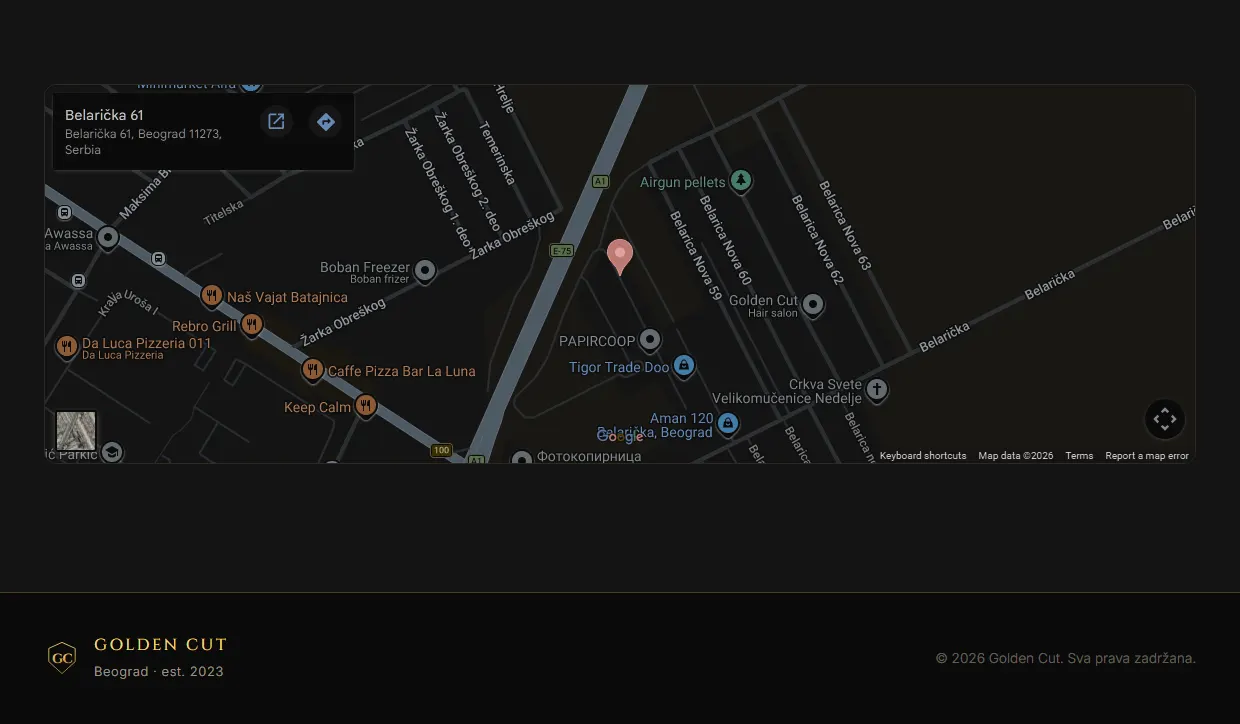
The chair rental aimed at other barbers appears only after the customer has been served, and then the page closes with hours, address and one more way to call. The last objection is rarely about wanting it, it is about whether it fits into an ordinary week.
Nothing after the decision
The footer stays short and carries only what a returning visitor needs. Once the ask has been made, more links are just noise, and a page that stops cleanly leaves the impression of a business that knows what it wants from you.
Nothing here is a default.
Every spacing value, type size and pause in this layout came out of testing rather than taste alone. The same system has been run through enough builds, rewrites and split tests that the guessing part is mostly gone: what stays is what kept working.
The copy is treated as part of the interface, not as filler poured in at the end. A heading is a promise, a button is an instruction, and a paragraph exists to remove one specific objection. Where the project sells something directly, the checkout path is designed first and the decoration second, because an extra step before payment costs more than any visual ever earns.
Want this kind of thinking on your website?
Two sentences are enough to start. What you sell, and who you sell it to.
You get an honest answer on whether a website solves your problem at all, what it would cost, and how long it would take. No pitch deck, no discovery call that turns into a sales call.